
It’s akin to finding the sweet spot between simplicity and complexity, and it’s a balancing act that requires a meticulous understanding of the subtleties of color theory and design principles. This article embarks on a comprehensive exploration of this fascinating aspect of interior design, providing an in-depth look into how neutrals can not only survive but indeed thrive in bold, vibrant settings.
Neutrals, in their muted simplicity, are often overlooked in favor of their louder, more attention-grabbing counterparts. However, these unassuming shades carry an understated power that can transform a space when applied with precision and finesse. More than just a safe choice, neutrals can serve as the perfect foil to bold colors, striking a balance that brings out the best in both.
Throughout this article, we’ll delve into the manifold ways in which neutrals can be manipulated to enhance the aesthetics of a colorful environment. From the strategic use of color to texture, lighting, and spatial planning, this discourse covers all the crucial elements necessary for understanding and implementing effective design strategies. With a meticulous approach to the subject, we aim to unravel the intricate dynamics of neutrals in vibrant settings and how they can be harnessed to create beautiful, balanced spaces.
We’ll start by building a foundational understanding of what neutrals are and why they matter in the realm of interior design. Here, we’ll also debunk some of the common misconceptions that relegate these shades to the background, highlighting their potential to act as pivotal elements in a design scheme.
Next, we’ll delve into the principles of color theory, honing in on how neutrals interact with bold colors. Whether they’re acting as a harmonizing agent, a buffer, or a stark contrast, understanding these interactions is crucial for mastering the art of blending neutrals into colorful environments.
Then, we’ll transition into discussing the role of texture and patterns. Beyond color, these elements can significantly impact how neutrals are perceived and can dramatically enhance their presence in a space. From plush fabrics to glossy surfaces, we’ll explore how different textures can either amplify or soften the impact of neutrals.
Lighting, often an overlooked aspect, plays a pivotal role in showcasing neutrals. The interplay between light and neutrals can dramatically alter the visual perception of a space. We’ll dig into the nuances of how to use lighting to your advantage, accentuating the beauty of neutrals even in the most colorful of environments.
Lastly, we’ll discuss how spatial planning and arrangement can enhance the effectiveness of neutrals. The right layout can make or break a design, and understanding how to position neutrals within a vibrant setting is key to achieving a harmonious balance.
This article is more than just a guide; it’s an exploration of the art and science of design, seen through the lens of neutrals in colorful settings. It’s a journey into the fascinating world of colors, textures, and spaces, designed to equip you with the knowledge and tools necessary to create balanced, visually appealing environments. So, fasten your seatbelts, and prepare for a deep dive into the world of neutrals and colors!
The Art of Balance: Understanding the Role of Neutrals in Vibrant Spaces
When it comes to the world of interior design, the spectrum is a playground of endless possibilities. From muted hues to bold and vibrant colors, there is a whole world of shades that can redefine and transform any space. However, amidst this rainbow of possibilities, neutrals have always held a significant role, often acting as the perfect canvas that lets the brighter colors shine. Let’s delve into the technical aspects of how neutrals can thrive in bold and colorful environments.
For those who may be unfamiliar with the term, neutrals refer to shades such as beige, ivory, taupe, black, gray, and shades of white. These colors are often considered ‘safe’ or ‘boring,’ but they are anything but. In the world of design and décor, neutrals play an integral role in bringing balance and harmony to a space.
The first thing to understand is that neutrals are not necessarily ‘colorless.’ They come in various undertones and can have warm or cool tones. This feature alone can significantly influence the mood and feel of a room. Now, let’s explore how these underrated colors can hold their own in a vibrant environment.
Neutrals as a Balancing Act: Bringing Harmony to Bold Interiors
Neutrals may not be the first choice for those who love bold and colorful interiors. But they serve an essential function in balancing out the intensity of such designs. Neutrals can act as a soothing backdrop, preventing the vibrant shades from becoming overwhelming or chaotic. They essentially provide the eyes with a ‘resting’ space amidst the color and pattern play. This, in turn, allows the brighter hues to truly stand out and make their impact.
One can view a neutral backdrop as a blank canvas that allows the vibrant colors and patterns to take center stage. Furthermore, neutrals can add depth and sophistication to an otherwise bright and lively space. A well-placed neutral element can create a striking contrast, lending the room a refined, polished look.
But how do you incorporate neutrals effectively without making the space feel dull or washed out? The key lies in understanding the role of texture and pattern, as well as the strategic use of accent colors. Watch the video below from the YouTube channel “Interior Design Ideas” titled “How to Use Neutral Colors in Interior Design” to learn more about this subject.
Playing with Texture and Pattern
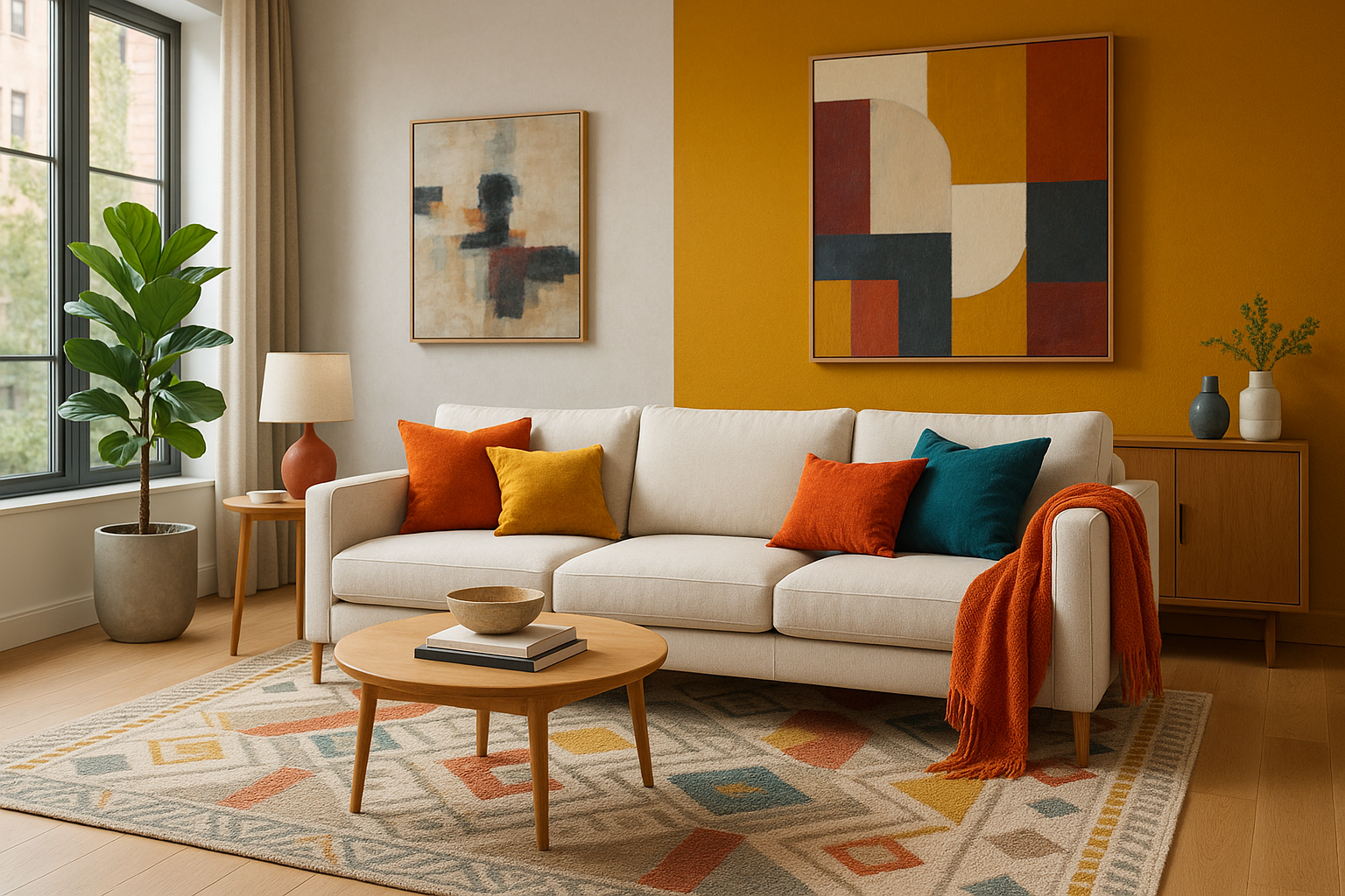
One of the most effective ways to make neutrals interesting is by playing with texture and pattern. Even a room decorated entirely in neutrals can feel dynamic and inviting if these elements are used correctly. For instance, a cream-colored sofa might seem bland on its own, but pair it with a textured throw and patterned pillows, and you have a visually intriguing setup.
Textures and patterns can add depth and visual interest to a neutral palette. Textures, whether it’s a plush rug, a sleek leather couch, or a knitted throw, can make the space feel more inviting and comfortable. Patterns, on the other hand, can break the monotony and add a dash of playfulness to the space.
The key is to mix and match different textures and patterns to keep the space from feeling flat or boring. A mix of smooth and rough textures can create a pleasing contrast, while a combination of large and small patterns can add a layer of visual complexity.
Strategic Use of Accent Colors
Accent colors can bring a neutral palette to life. These are usually bold, vibrant colors that stand out against the neutral backdrop. The beauty of accent colors is that they can be easily changed according to mood, season, or trend.
Accent colors can be introduced in various ways, from a bright piece of art, colorful cushions, or a statement piece of furniture. The idea is to create focal points that draw the eye and add a burst of color to the neutral scheme.
Neutrals and accent colors work together to create a balanced and harmonious interior. The neutrals act as the calm, soothing backdrop, while the accent colors add the drama and excitement. It’s a balancing act that, when done right, can result in a stunning and visually intriguing space.
Table 1: The Power of Neutrals and Accent Colors
| Neutral Palette | Accent Colors |
|---|---|
| Provides a calming and soothing backdrop | Adds drama and excitement |
| Allows for a flexible design that can easily adapt to changes | Creates focal points and adds visual interest |
| Adds depth and sophistication to the space | Brings the neutral palette to life |
In conclusion, neutrals are far from being ‘boring’ or ‘safe.’ They are versatile, flexible, and can add a sense of elegance and sophistication to any space. By understanding their role and learning how to incorporate them effectively, we can create interiors that are balanced, harmonious, and visually stunning. So the next time you’re thinking about your interior design, don’t underestimate the power of neutrals.
Conclusion
In conclusion, the complexities that encompass the IT and engineering sectors demand an understanding of intricate concepts. As we have embarked on a journey to unravel these, it is evident that our explorations have brought forth salient points that are worth revisiting.
Firstly, we delved into the significance of software engineering in the ever-evolving digital landscape, highlighting how it empowers systems and solutions to work seamlessly in diverse environments. It’s also essential to note that the discipline has been at the forefront of driving technological advancement, given its ability to constantly innovate and adapt.
Secondly, we broached the importance of effective technical writing within the IT and engineering sectors. A well-crafted technical document not only clarifies complex concepts but also bridges the gap between tech experts and the end-users, enhancing the overall user experience.
The role of robust data structures in software engineering was also a crucial aspect discussed. The structuring of data in an efficient and organized way is key to ensuring that software applications run smoothly, providing optimal performance and user satisfaction.
Another key takeaway was the application of quality assurance in software engineering. The implementation of rigorous testing and validation processes is critical in ensuring the end product is of the highest standard, free of any bugs or glitches that could affect its functionality.
Lastly, we touched on the significance of keeping abreast with the latest technological advancements. Continuous learning and adapting to the ever-changing tech landscape is an essential trait for every IT professional, helping them to stay relevant and effective in their respective roles.
The field of IT and engineering is a dynamic and ever-evolving space, with new developments constantly emerging. Embracing these advancements and enhancing our understanding of them can greatly improve the quality of work we produce and the value we provide to our end users.
I invite you to share your thoughts on these points, shedding light on any personal experiences or further insights you may have. Your feedback not only enriches the discussion but also contributes to a more well-rounded understanding of these topics.
Moreover, I encourage you to apply these concepts in your professional sphere, sharing the knowledge with your colleagues and peers. It’s through the dissemination and application of this knowledge that we can truly harness the power of IT and engineering, propelling ourselves and our industries forward.
For further reading and a deeper dive into these topics, I recommend visiting IEEE Computer Society and ACM Journals. These platforms offer a wealth of information, encompassing an array of topics within the IT and engineering sectors.
Thank you for your time and engagement in this discourse. I look forward to continuing to provide you with informative and engaging content, aiding in the expansion of our collective knowledge base. Let’s continue to learn, grow, and advance together, pushing the boundaries of what’s possible in the IT and engineering realms.